
ACTION COMMUNICATIONS PROVIDES BRANDING SERVICES FOR SUNSHINE COAST ENTITIES
Action Communications is an up and coming Sunshine Coast branding agency, helmed by a duo with over 50 years branding experience between them.
Raised locally, with experienced gained from national roles in Sydney, NZ and the UK, directors Sherryl Caulfield and Anita Beasley are experts in managing new brand creations and rebrand projects for clients on the Sunshine Coast and further afield.
First, we work through a strategic brand process which pulls together all the elements that your new brand needs to say to reflect who you are and what you offer.
Next, we work with a trusted team of designers to deliver strong and exciting brand identities for business of all sizes including NFPs. There are four designers we work with and we choose the designer that is the right fit for your business and budget.
Our services cover:
- Educating clients about branding and the brand process
- Brand Workshops
- Understanding the heart of your brand – your essence.
- Developing clear brand briefs
- Creating New Brands
- Revitalising existing Brands
- Developing Logos, Brand Identities and Design suites
- Establishing Brand Goals
- Creating Branding campaigns across digital and traditional implementation, and
- Writing and producing Brand stories (including videos)
Our Branding Process
As part of this process we work with you to understand your passion for the business – why you created it? We look at your competitors too.
For new entities, as much as possible, your brand name needs to reflect your brand essence.
We ensure your BRAND NAME is easy to say and easy to remember – but most importantly reflects your BRAND ESSENCE. We also ensure it’s a name that’s available from an IP and Domain point of view.
Below are three client examples, all rebrands, which dramatically advanced these brand identities.
eco@jumrum
Steve Taylor & Partners is a Queensland eco-developer responsible for estates at Pumicestone Passage that ensured the optimal balance of buildings and trees.
For his project in Kuranda, near Cairns, his eco development offered great lifestyle blocks in the rainforest yet his branding was missing the mark.
Action rebranded the estate from Jumrum Rainforest which came across more as a national park to eco@jumrum with a tagline that clearly said what the offering was.

The new logo:
- Is shorter, easier to remember and easier to say. The word rainforest did not flow after rum – say it out loud and you’ll know what we mean.
- Presents an authentic and modern eco lifestyle brand essence.
- Establishes the estate as an aspirational suburb.
- Reflects nature in a stronger way.
- Better positions the developer who has a reputation for being environmentally friendly (saving trees and ensuring greenbelts).
Note: the estate has all sold out and with that the website has closed. Their Twitter account is here.
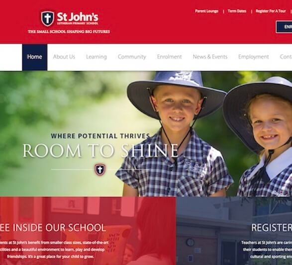
St Johns’ Lutheran Primary School (Bundaberg)
Outdoors Queensland
Queensland Outdoors Recreation Federation (QORF) — a mouthful, right? — was wanting to change their name but was prevented in the short term due to various factors.
Representing the interests of the outdoors sector, the organisation is based in Brisbane with staff in Cairns, the Sunshine and Gold Coasts, and the NaturePlay organisation under their helm. During a marketing planning workshop we recommended:
- A bridging strategy with the organising moving to QORF and adding the tagline: Live Life Outdoors. The tagline was soon adopted by their Victorian counterpart.
- They use a green O (for Outdoors) as a key graphical device.
After constitutional change and a brand workshop, we were able to create a modern logo, giving this organisation a relevant and more commercial, tourist-like brand identity.
The new logo maintained the green of the earlier design with the circle still being able to be used as an iconic device (and shortcode for Outdoors) with the Q for Queensland being inset.
This design worked equally well without the blue Q, due to the reverse space showing the white Q. However the client preference was for the blue Q inset.
Think your brand might be holding you back?
If you’re a company experiencing awareness problems — or if you’re a new venture and need an exciting platform to establish your market presence, please get in touch. There are some good designers out there — and we work with them — but first you need to get your brand strategy and name right and create a clear brand brief before you swing into design.
The name and branding of your company is integral to its success and worth the investment to get it right.