
Logo legacy — how much of your old logo should you keep?
From time to time we work with organisations that grapple with what to do with their logo? How to move forward with a modern design but still honour their heritage. It’s a logo legacy conundrum that calls for a smart and sensitive rebrand. That means getting perspective and strategy right first, and ensuring you understand your brand’s essence.
Since mid 2019 we have been working with Apex Camps on the Sunshine Coast managing all their marketing for their Mudjimba and Magnetic Island facilities.
When we came on board a number of people working at the organisation felt that the organisation had low brand awareness, amongst certain locations, demographics and sectors throughout Queensland.
In the absence of quantitative research (and funds to undertake such research) it was hard to obtain an objective view on this. However, given the increasing number of providers of outdoor education and corporate team building, the landscape was without a doubtmore competitive and harder for them to gain a voice without a series of initiatives and investment.
Heritage
People of a certain age group may not have heard of Apex Camps but they have heard of Apex Australia. It’s a civic service organisation or club not dissimilar to Rotary, Lions, Jaycees, or the CWA, whose members provide volunteer services and fundraising for local infrastructure, aid / counselling or opportunities. They would have been the original Bunnings BBQ brigade. Sadly volunteer rates in Australia and the world have been on the decline which means these service organisations have much lower brand awareness and participation rates.
Apex Camps was an initiative of Apex Australia – originally conceived to provide a camp holiday experience for under-privileged children. Apex Camp’s logo reflects the connection to Apex Australia. Designed several decades ago, it’s what we would call a legacy logo. Marketing mediums and logo design have come a long way since then and as such their logo and its application was doing the organisation a disservice.
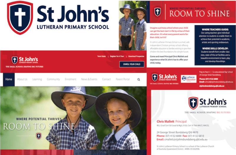
See how small it is on their website. Size matters! While you don’t want a logo to scream at you it needs to be viewable and legible.
To address this the organisation had decided to promote its locations (Sunshine Coast and Magnetic Island) but their brand name got lost in this iteration.
![]()
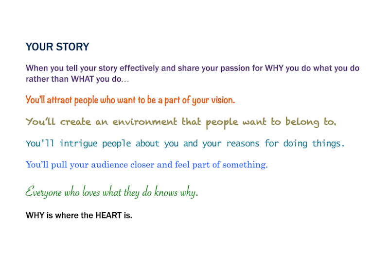
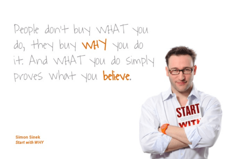
As well, value space was taken up promoting what the organisation did (partly a given if you could read the name), rather than WHY go to Apex Camps.
Through a brand workshop and strategy process we identified their why, what had been their constant brand essence for decades and recommended a new creative direction.
We believe this tagline was something that they could uniquely claim given the purpose for why the camp was established in the first place. It also works for every group coming along to the camp, from leadership development to team building, from family functions to holiday programs and more.
![]()
Sadly due to Covid-19 and the cancellation of all school bookings for most of 2020, this work and final artwork was put on hold.
Still, it does reinforce the importance of recognising when your logo no longer serves your needs and making appropriate modifications. We are confident the organisation will address this before too long.
Discover how we helped other organisations update their logo through our brand workshops and re-branding process, HERE and HERE.